PocketBook
PocketBook streamlines the booking process for artists and venues.
Overview of the Project
Summary: In short, the goal of this project was to create a Minimum Viable Product that would allow the client’s vision to come to fruition while keeping the user’s process intuitive and concise. This goal was accomplished by fashioning a deliverable that prioritizes a simple and robust user flow.
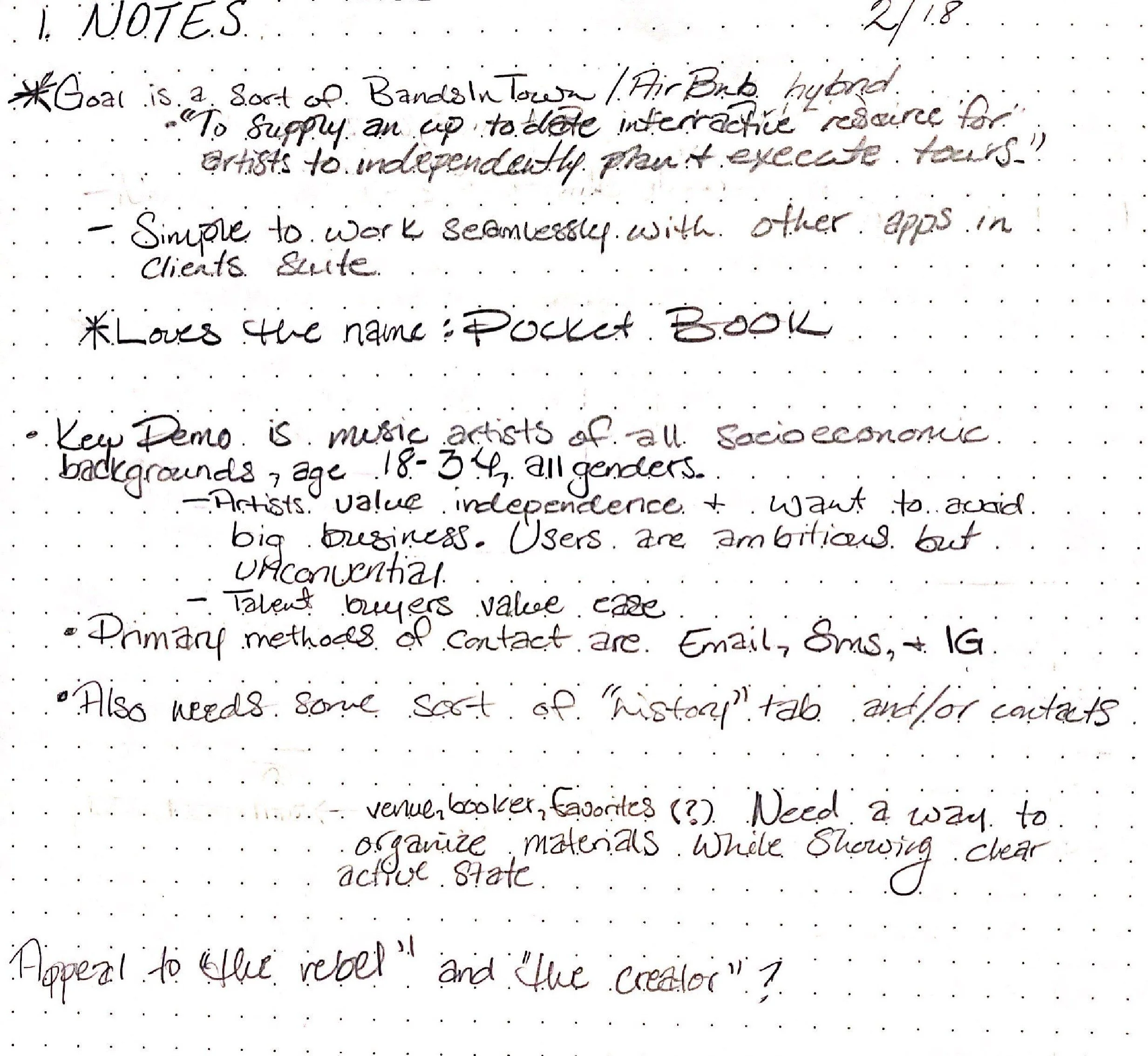
“Overall, the vision is to have an up-to-date interactive resource for artists and their teams to use to independently plan and execute tours at various stages.” -Shams Sharieff, Client
Roles and responsibilities: As lead designer during the first phase of this project, I was responsible for delivering user journey maps, personas, Competitor Reviews and Takeaways, Sketches, Accessibility Measures, User Flows, Sitemaps, Wireframes, and Clickable Prototypes, User Interviews, Usability Reports, and Revisions.
Problem: How do we create an accessible digital solution that simplifies the artist & venue booking process?
Audience: The primary audience can be described as Musicians aged 25-32 who make a rough total of $42k/year from 2 or more sources of income. Talent Buyers/Bookers are a secondary audience
Solution: By placing a detailed emphasis on the “profile” page of the application, I was able to keep the product simple but effective. By taking this approach the artist searching for a venue (or venue representative searching for an artist) is quickly able to see an overview of status on the app and standing within the community via a rating system after narrowing down their selections according to the most applicable parameters. Using this approach, the user is given the bulk of information after they have indicated what they wish to see and voiced their needs in the form of filters.
Process
Discovery and Research
Summary of the survey and data and a description of how the findings drove your process: Surveys showed that the primary audience is described as Musicians aged 25-32 who make roughly $42k/year from 2 or more sources of income. These simple findings spoke volumes when it came to what sort of app I wanted to create. I sought out to make an app that would allow users to save time when completing a process that can be daunting, to say the least. I sought to even the balance for the group which, according to survey results, spends exponentially more time searching for gigs and waiting for correspondence than actually performing. Even more, I placed an immense emphasis on ensuring that the entire process was made more transparent by PocketBook and that as much information as possible was available without having to wait for a response, requesting a PDF of a backline, or having to download files containing the information every artist needs before knowing whether the venue is right for them.
I began by jotting down my thoughts about flows, possible features, and who our client might be. Although these aspects of the process were assumptions to an extent, they were also based on my experience as a performing musician, as well as a rough recollection of my network of other musicians.
I did have a relatively clear picture of who the target audience might be, based on my own professional experience and the notes I received from my client. However, during the first portion of the process, I like to write down my assumptions to keep me accountable and also begin the process of brainstorming about things that may be beneficial to the user.
User pain points:
The current process of booking venues takes too long
The time spent booking and vetting venues could be used to create more content or rehearse
Finding the right contact information is often less than straightforward
Getting backline information requires establishing contact first
Establishing contact is not guaranteed and even when it is, it can take weeks or months with very little transparency as to exactly how long
It's pointless to wait extended periods of time for response, only to find that the preferred date and/or time slot is unavailable
PocketBook
Strengths
- Novel platform
- Caters to Musicians and venues that serve them
- Services entire united states
- Two-way street
- Part of a larger ecosystem to address peripheral needs
Weaknesses
- Less Established than other apps
Opportunities
- Still in the growth phase
- Template can be used for other industries as well
- Need to encourage membership
Threats
- Has the potential to fly too close to the sun if a strong foundation isn't created
- Needs funding and user support
Peerspace
Strengths
- Established platform
- Appeals to a variety of venues and needs
- Services Major cities
Weaknesses
- Does not service many cities outside of the major 7
- Falls short of industry-specific offerings
- Caters more to photography and party style events
User persona(s) motivations, goals, and frustrations

Here we have a persona composite of the users I interviewed:
Cameron Williamson is a 27-year-old, single, Barista with a Master’s degree in Liberal Arts. He resides in New York City and maintains a high tech literacy.
“I’m used to spending a few hours per week trying to book venues for my indie band but sometimes it feels like I’m yelling into the void”
Cameron is described as an extrovert who is quirky and upbeat.
Core needs:
To be able to make more money from their passion
To spend more time writing new music for the band to perform
The price of the service is very important
Frustrations:
Spending too much time looking for venues means they’re spending less time creating content
Currently finds gigs from past work relations, family, friends, and within professional circles and online which is tedious
Not much choice. must take gigs as they come.
Favorite brands:
- Fender
- FreshDirect
Payment Medium:
- Digital Payment
- Cash App
- Venmo
Preferred Platform:
- Mobile Application
Information architecture
User stories for the MVP and why I prioritized them:

At the onset of the narration phase, my foremost goal was to capture the process in its simplest form. By beginning with the storyboard, I was able to see the broad strokes of what it would take to complete the primary task of the app while also empathizing with the process of preparation that the user undertakes. This aspect further allowed me to embody the understanding that the user's journey does not begin when they open the app. In fact, the user's journey begins years before as they hone their crafts, months before as they rehearse enough to reach the confidence to seek a booking. In all stages, time is a precious commodity that is best allocated toward the craft the user has chosen.
With this in mind, my next task was to parcel the leaps of the storyboard into actions that more closely resembled steps, through the use of user stories:
As a new user, Cameron must decide whether they would like to see the Artist view or the Venue view to ensure that they are shown the appropriate category of results.
High Priority- this task is to be completed during the onboarding process. The user can change the view in profile settings if they ever change their role or need to curate a lineup.
As a new user, Cameron must set up their profile page to show users who are searching for them what they have to offer and match them with the appropriate venue.
High Priority- this task is to be completed during the onboarding process
As a user, Cameron must select a search view to narrow down results by the appropriate parameters.
Low Priority- Cameron can search without narrowing results but more appropriate results will be shown if filters are used
As a user, Cameron must reach out to the venue to show interest in performing
Medium Priority- In order to be booked, the venue can also reach out to Cameron; however, the process may be quicker if they reach out as they decide they are interested
As a user, Cameron must chat with venues to define contract terms
High Priority- No matter who reaches out, a chat must be initiated in order to book through the app to ensure that contract terms are agreed upon
As a user, Cameron must accept the proposed contract to indicate that they are ok with the terms and add the booking to their schedule
Medium Priority- If Cameron approves of the terms, they must confirm the booking. If not, Cameron can ignore the terms and leave the chat to leave their booking unconfirmed
As a user, Cameron must rate the venue after they perform to show other users which venues are trustworthy
Low Priority- This task does not prohibit the use of the application but it is requested/recommended in order to give users more confidence in the app and voice concerns about shady venues.
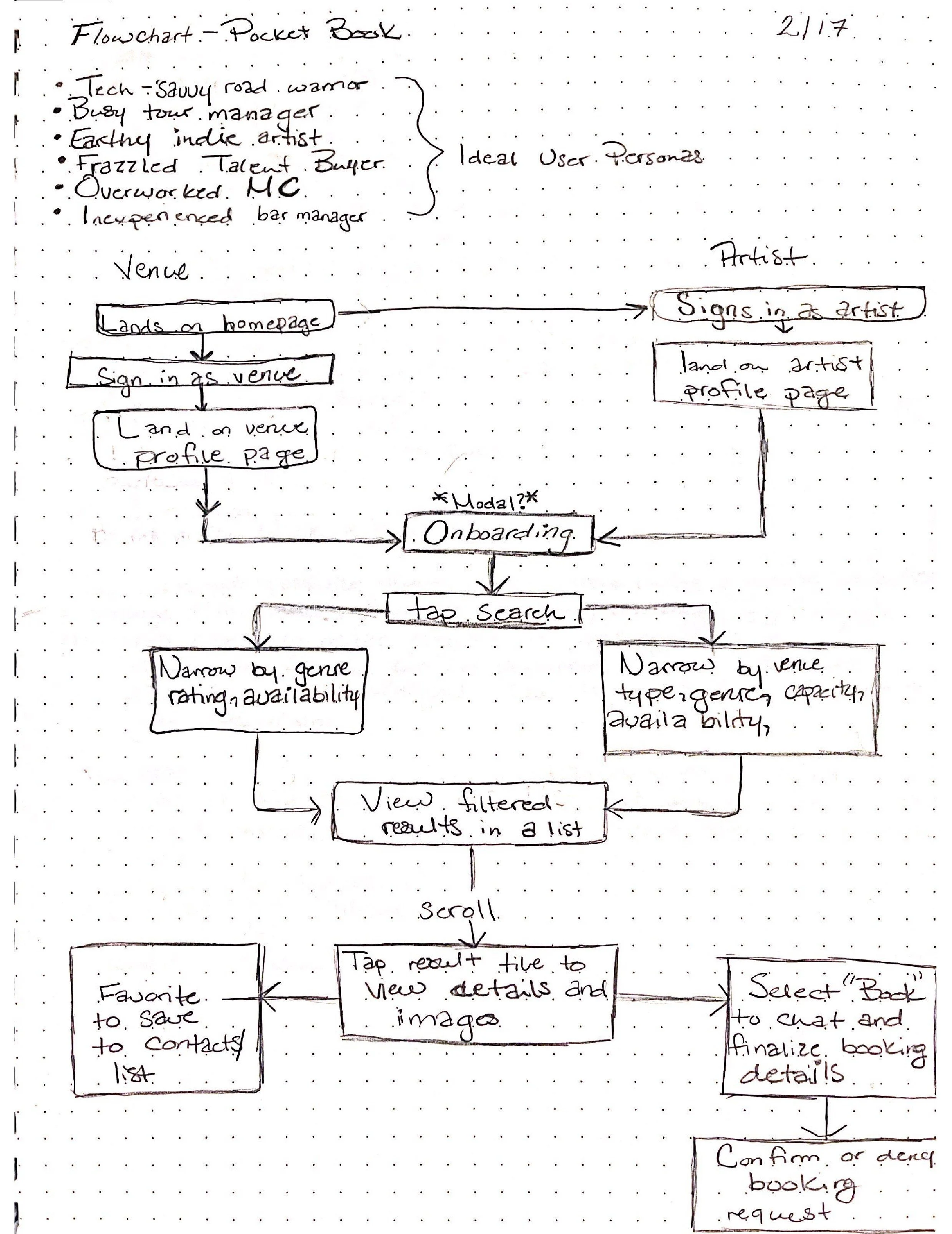
User flows:

Eventually, the user flow pictured above took shape. Although the main goal of this project was to cater to the artist, we also faced the challenge of creating an application that would be usable by Talent Buyers, Bookers, and Venue Managers who might be looking to employ our primary targets. Furthermore, we wanted a way to do this that would mirror the simplicity of the artist view.
Wireframe sketches:

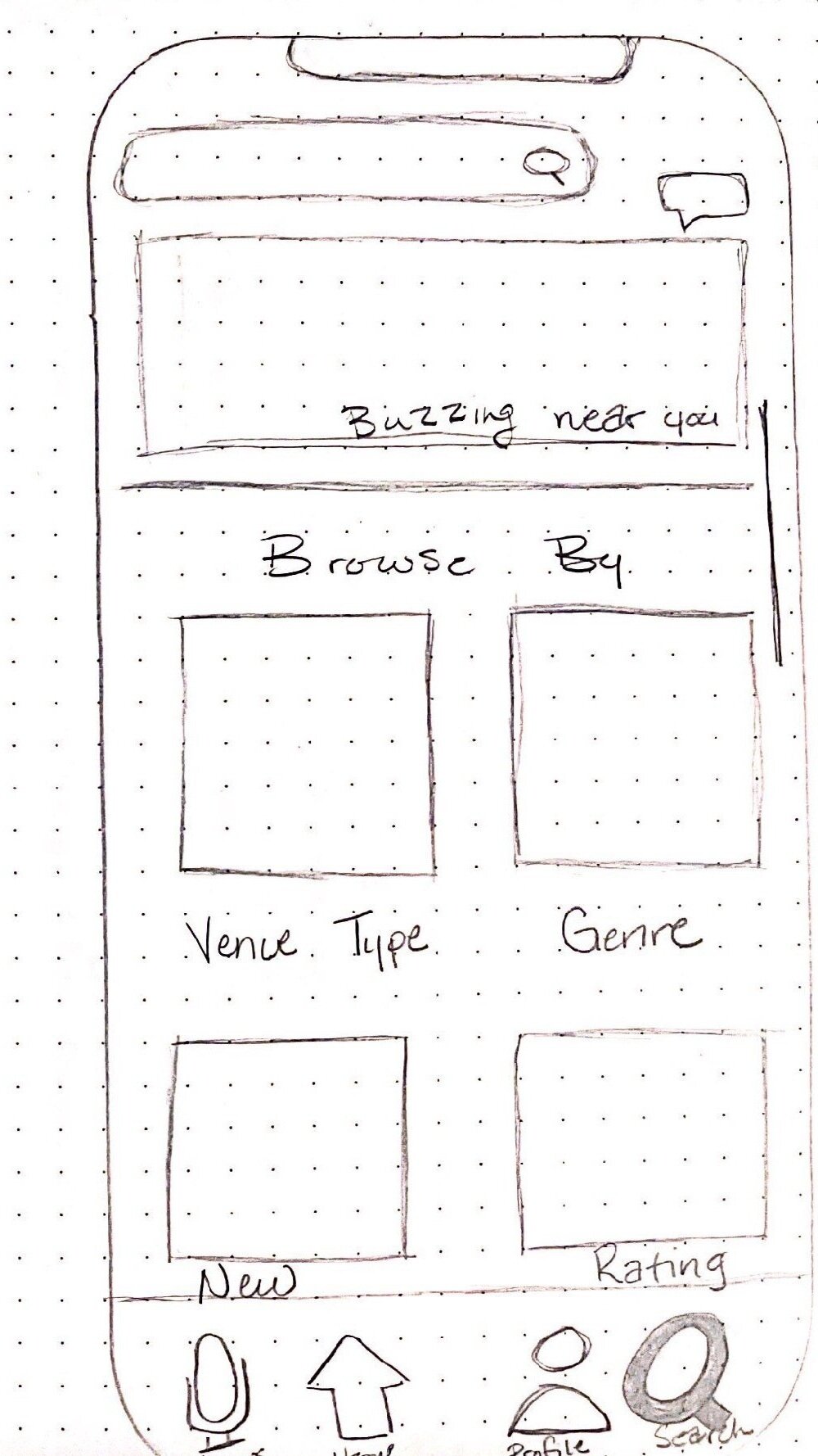
After determining the apparent flow that the user would follow, I wanted to begin the undertaking of mapping what a flow might look like in an actual wireframe format. While this sketch flow seems simple enough, my goal was to throw as many different features as possible into the mix and later trim down those features or find ways to automate them. Thankfully, I was able to achieve this goal.

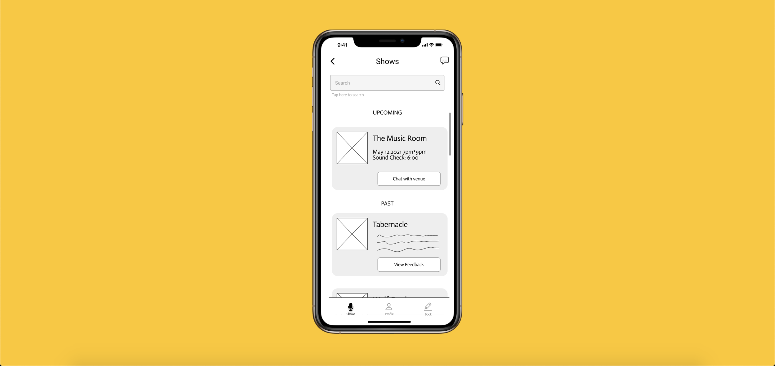
Having considered the entire process up until this point, the next task of my sprint was to refine key screens even more. In a series of rapid iterations(left to right, top row first), I explored what the search result screen might look like, how the navigation bar would be laid out and show active states. I mused about the location of the profile page and how it might be viewed as well as how users might recognize inbox messages and how users might be shown the result’s reputation within the ecosystem.

Following that series of iterations, I began to dive deeper into what the two highest priority screens might look like. In this case, I began to detail the venue detail page and the “home” page that would later become the “book” page (for clarity). I theorized the solution above before clarifying in the image below.

In this first iteration of wireframes, we fortunately faced a few issues. I say fortunately because, during user testing, these issues circled above gave us great insights into what our users really required and enjoyed. From right to left, we almost immediately found that the phrasing of the navigation bar was counterintuitive. Nearly all of the users tested assumed that the way to complete the primary task was to select “shows” rather than “search” as I had initially intended. This stark miscommunication on my behalf reminded me that it makes no difference if I understand it, the alternate perspectives of the users will uncover plot holes wherever they lie. I greatly appreciated this reminder, because it served as a notice to remain empathetic throughout the process and allow critique to sharpen my skills as a designer.
Next, I found that the “chat with venue” button was simply too small. While it was perceivable by most of the users, there was still a small set of users that found the size to be difficult. It was a small change that made a huge difference later on during the testing phase as we sought critique for the revised iteration.
Lastly, we found that the “tips and tricks” page was simply unnecessary. Initially, the users were completely confused by the purpose of the page and I came to realize that it did more harm than good. The removal of that page freed users from the mental stress of figuring out indirectly related information and led us to a more streamlined solution that not only did the job, it did that job very well, much better without the fluff. All of our testings led us to the final prototype and wireframes below.
Final Digital Lo-Fi wireframes:


Tasks tested:
Booking a venue
Send message to a venue
Viewing and editing profile contents
Familiarity with app elements
Narrowing down search results
Overall experiences:
During testing, we demoed two iterations. One was not viable which led us to create and test a second one. This allowed us to see a broader range of issues and correct them.
While most users had issues with the first iteration, the second iteration and second group of users tested were able to complete all requested tasks in significantly less time and far more intuitively due to the stripped-down nature of the latest iteration and more appropriate labeling.
Based on user interviews, the app could benefit from increased functionality in later updates (the ability for artists to collaborate on lineups).
One user recommended allowing artists to switch between artist and venue roles at their convenience in order to facilitate collaboration.
Overall, the users seemed to appreciate the new ease that was offered by the application, on both sides of the fence; artists and venues (talent buyers) in such a way that even non-artists were able to intuit the process.
Next steps for improving the app
Create a style guide, design system, and high fidelity mockup.
Complete the “venue view” and translate the hi-fi mockups into a high-fidelity prototype.
Fund further research and development for the application so that it can be launched on a national, and then international scale.
Final thoughts
All in all, the project was a great one to undertake and I look forward to further developing the product into one that will hopefully ease the transition back into a worthwhile touring economy in the world of entertainment that persists in spite of the pandemic which threatens to end it.
The most standout lessons to me were the reminder to remain empathetic throughout every stage of the process and the assertion that a robust product does not need to be a complicated product.
I thoroughly enjoyed the insights that my focus group graciously shared with me which allowed me to refine and improve the app in a way and I look forward to implementing those insights as the project progresses into a fully developed mobile application and as I continue along the path of my career.