Mesh: Connect
Written by Alyssa Jones
Summary
Project Title: Mesh Connect
Project Status: In Production
Role: Lead Designer
Summary:
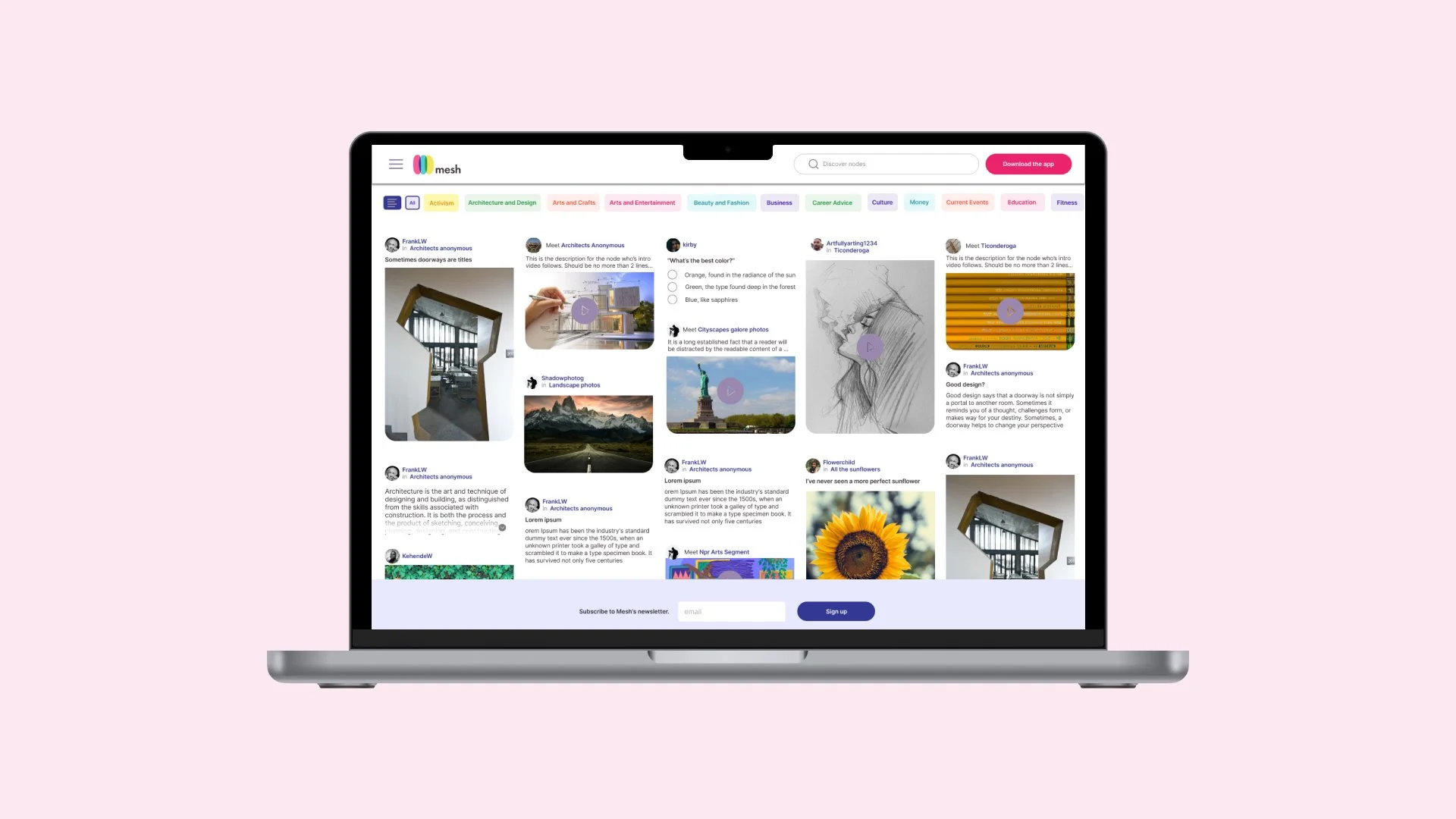
Mesh Connect was designed to improve accessibility and usability of the Mesh platform by providing a desktop-optimized interface and allowing users to explore its features without creating an account. This approach caters to curious visitors and desktop users, enabling them to experience the platform’s value proposition in a seamless and convenient way.
Outcomes:
• Increased user engagement by reducing barriers to entry.
• Improved adoption rates among desktop users, contributing to a 25% increase in new user traffic within the first three months.
• Enhanced perception of Mesh as user-focused and inclusive.
Solution
By deep-diving into competitors and distilling stakeholder wishlists, I was able to design a solution to fulfill both the aesthetic and functional requirements for a desktop entry point into the world of Mesh.
Process
Competitive analysis
To determine the best web page style for our users, I analyzed competitor strategies that balanced lite functionality with content previewing. My chosen competitors are:
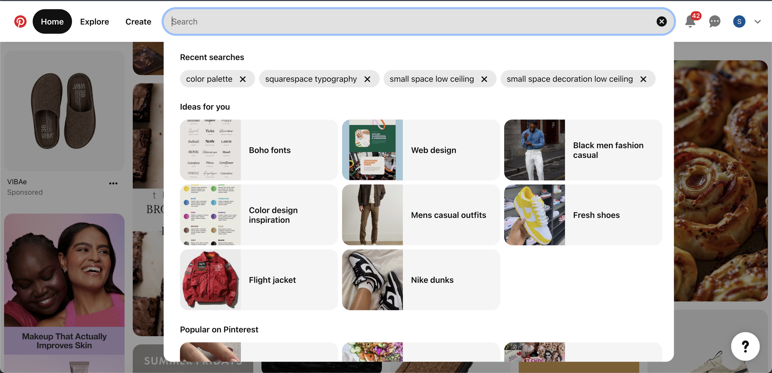
Pinterest.com is a visual discovery platform where users explore, save, and share ideas through “Pins.” The homepage features a personalized feed based on interests and activity, along with a search bar for exploring topics and trends. Users can save pins to themed boards, organize boards into sections, and access tools like “Explore” for trending content and “Lens” for visual searches. Profiles showcase saved pins, boards, and followers. Pinterest combines social networking, search functionality, and personalized content, making it a go-to platform for inspiration across various interests.

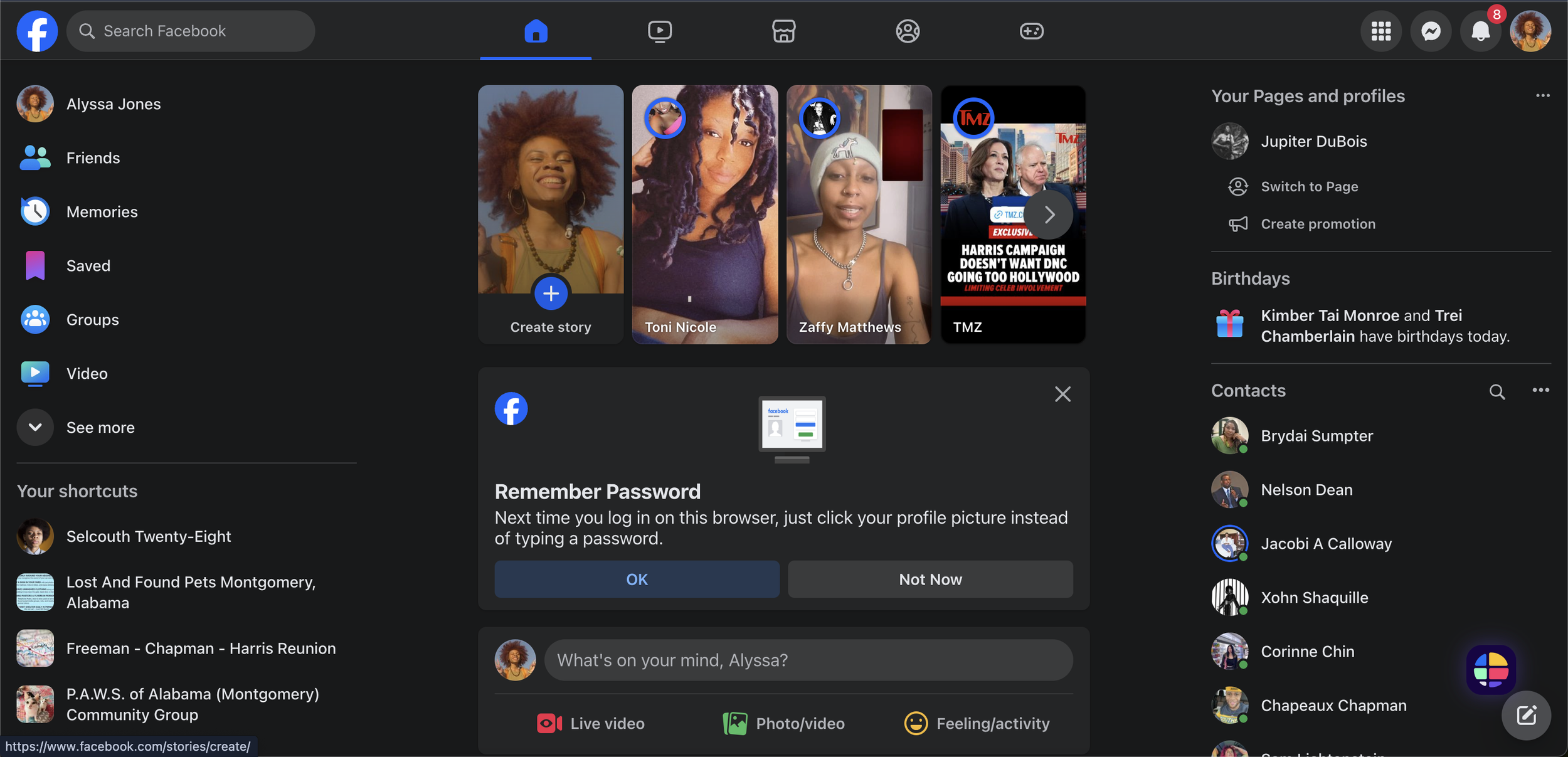
Facebook.com is a global social networking platform that connects users through profiles, content sharing, and interaction. The customizable news feed displays updates, photos, videos, and links from friends, family, and pages. Key features include a search bar, messaging, notifications, and shortcuts to groups, events, and other sections. Profiles showcase posts, photos, and personal details, while pages and groups foster community and business engagement. Additional tools like live streaming, stories, event planning, and a marketplace enhance interaction, making Facebook a widely used platform for staying connected.

Dribbble.com is a creative platform for showcasing and discovering design work in fields like graphic design, web design, illustration, and UI/UX. Its grid-based layout displays “shots”—snapshots of projects such as logos, app interfaces, and animations. Users can explore diverse designs, save favorites, and follow designers for inspiration. Dribbble also fosters community through networking, collaboration, and job opportunities, as companies frequently recruit talent on the platform. With its focus on visual content and creative connection, Dribbble is a top destination for designers to share, inspire, and network.

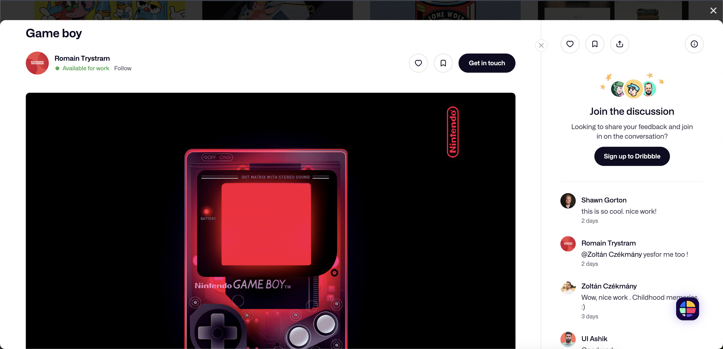
All in all, I came to these conclusions through analysis via a competitor matrix, pictured below.
Stakeholder Requirements
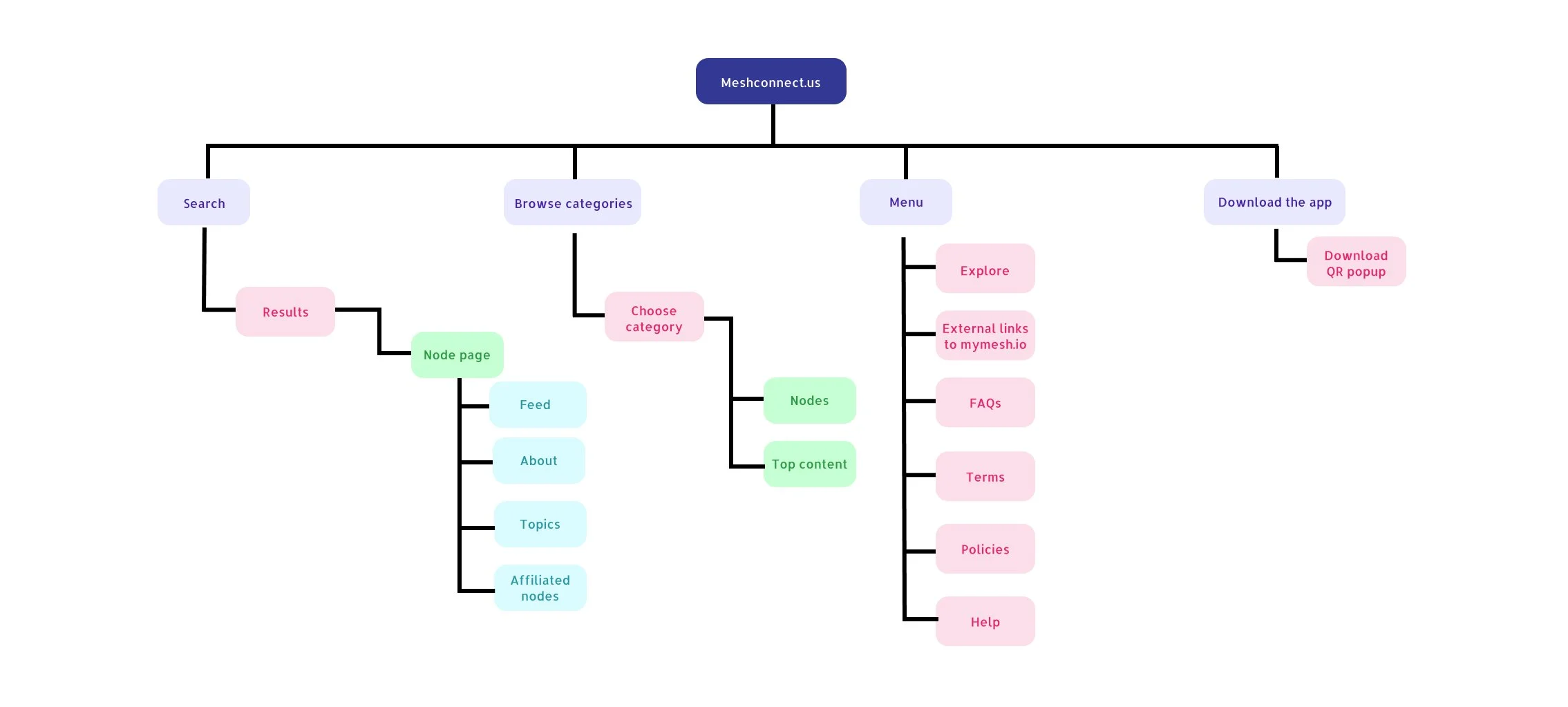
Next, I chiseled the stakeholder’s requirements into the following items for the MVP
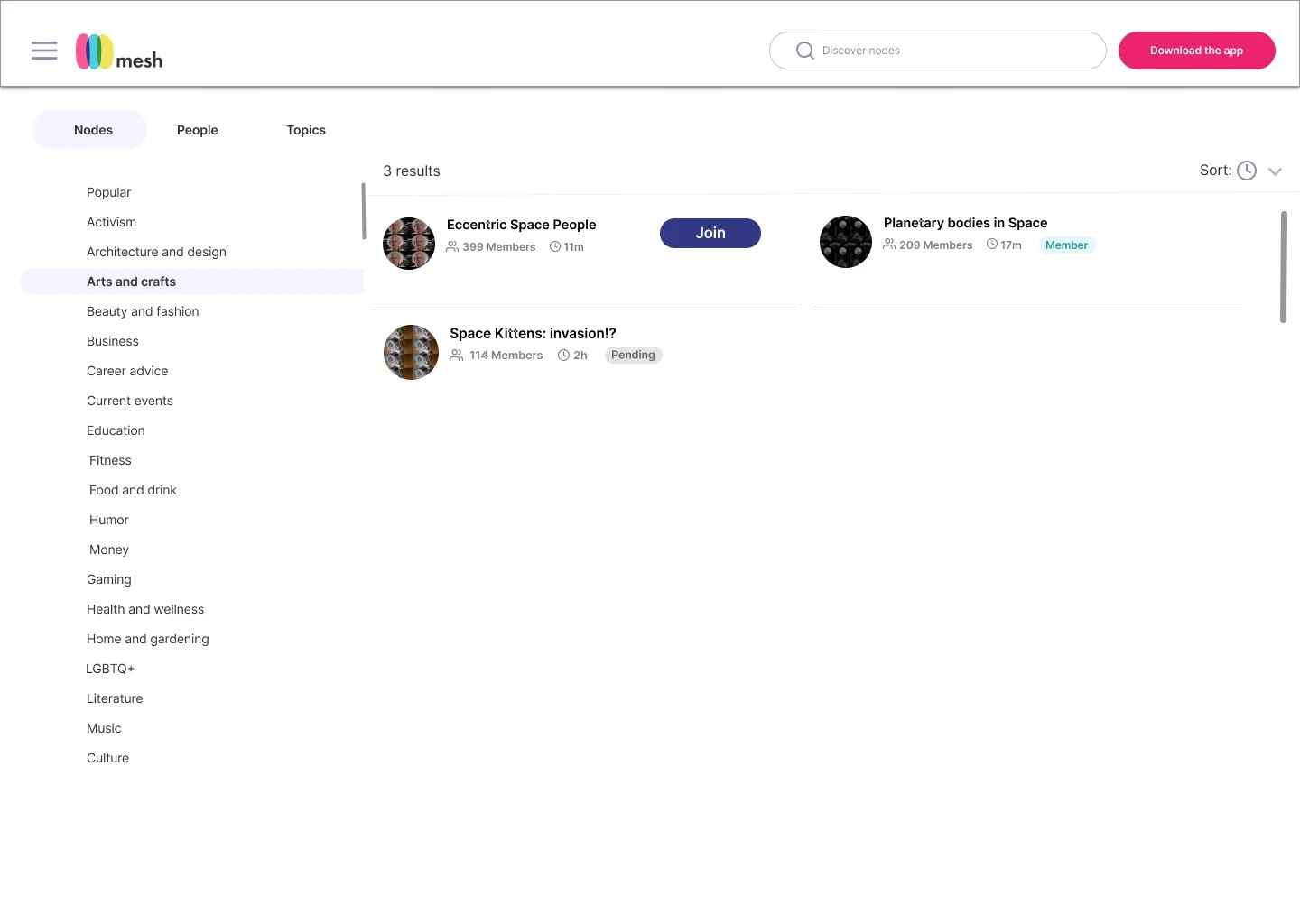
Read-only is preferred for V1
Discoverable nodes and explore
No login necessary for V1
Must be mobile and desktop-friendly
Must be able to preview primary content
Wireframes
A key challenge for this project was the tight timeline, which demanded efficiency without compromising creativity. After conducting research and refining stakeholder requirements, I presented distinct options to stakeholders, enabling me to narrow down the requirements into a solution that was both functional and enjoyable.
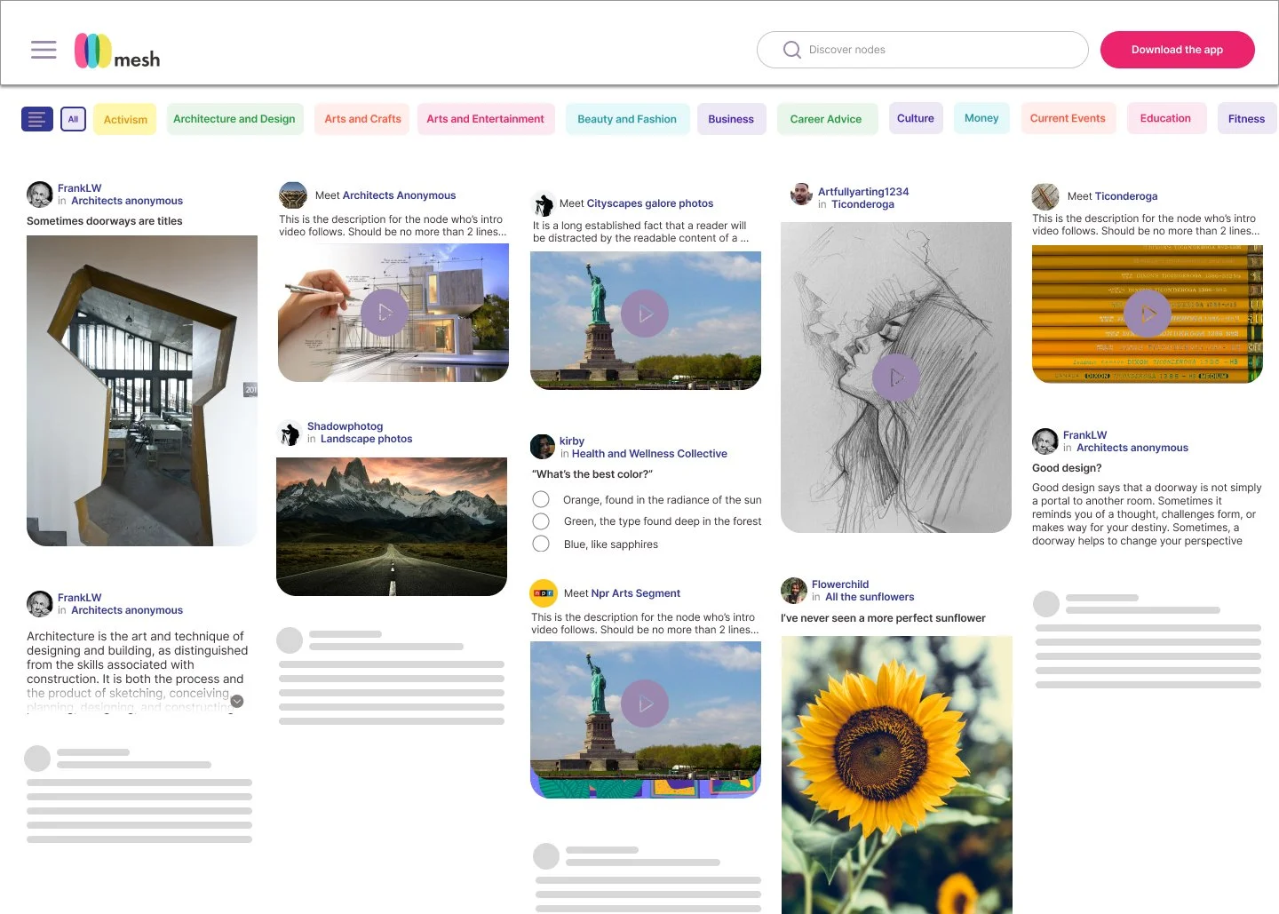
With this in mind, I gave 3 options for the landing page.
Option 1 features a list of nodes in the left panel, a feed occupying the right 2/3rds, a search bar, and prominently featured CTAs to download. Ultimately, I made these choices in an effort to give the user a platform that was somewhat visually familiar, chock-full of information, and transparent with the presentation of content and interactions.

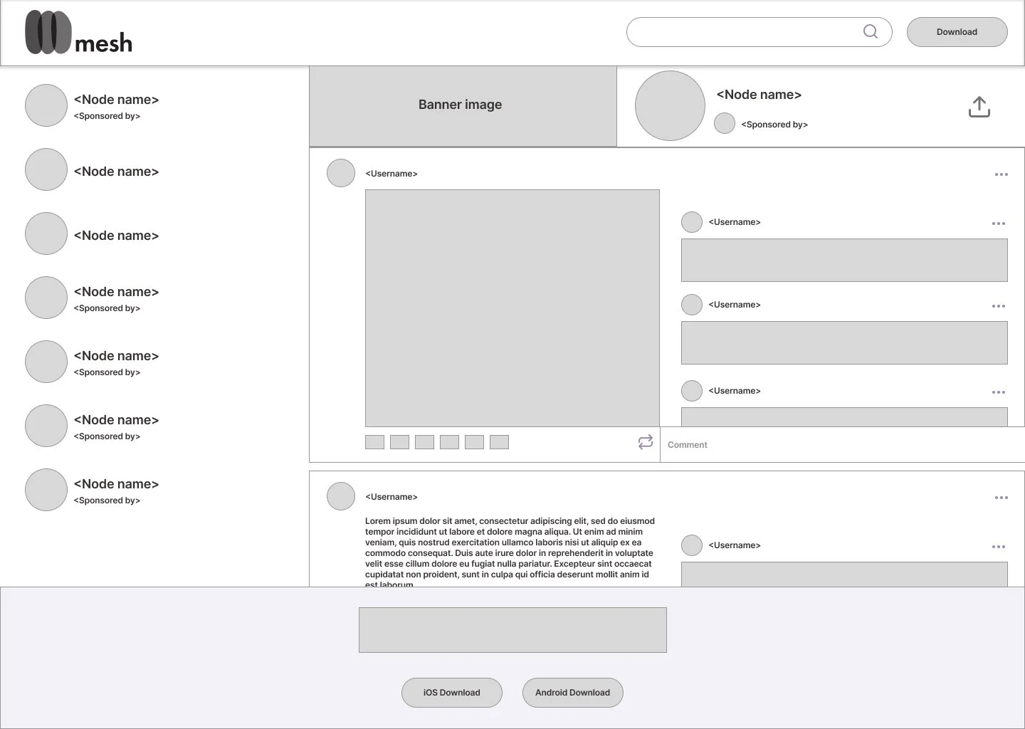
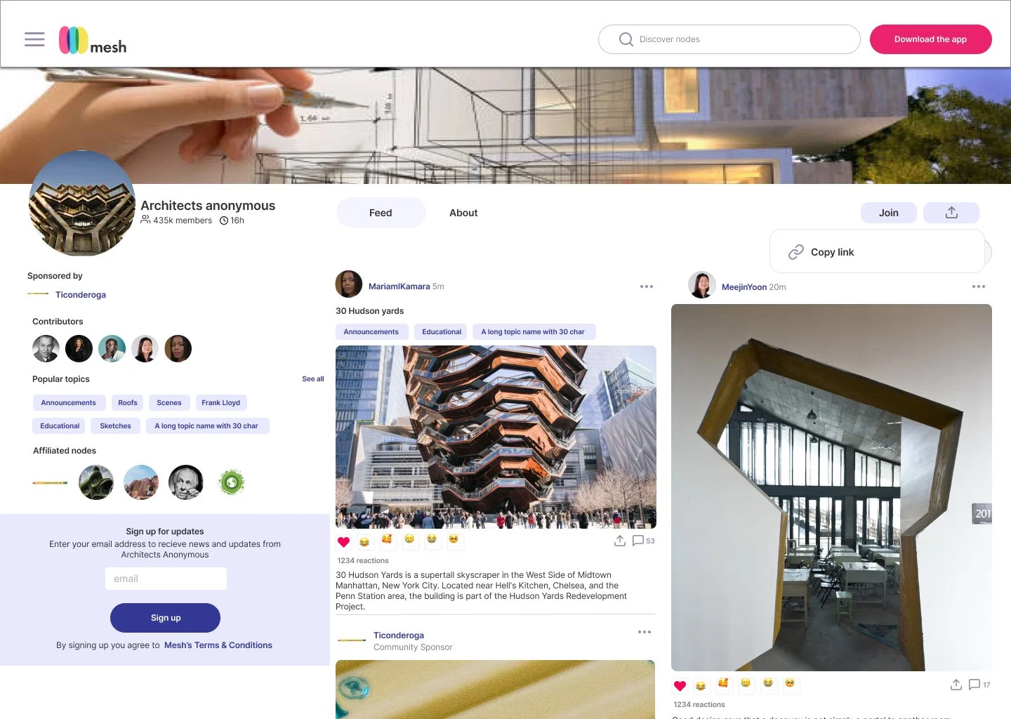
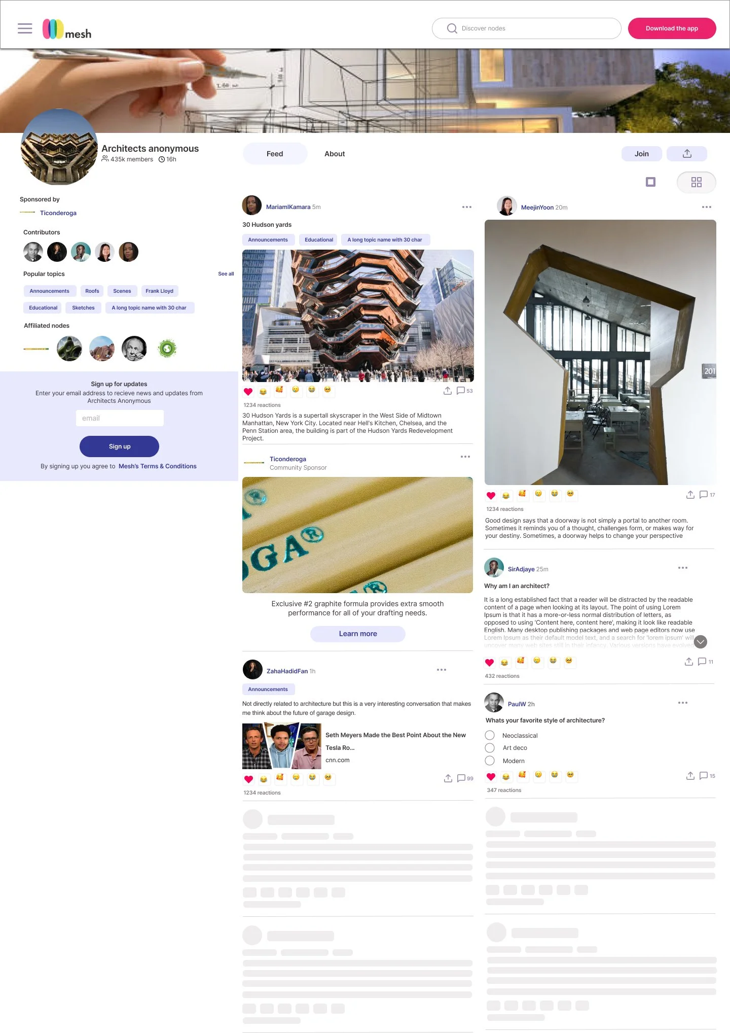
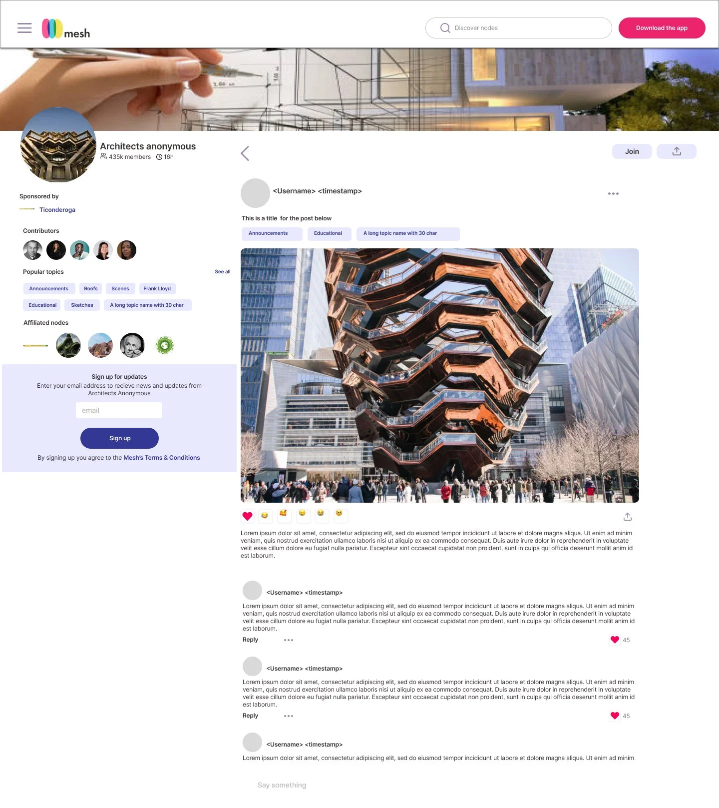
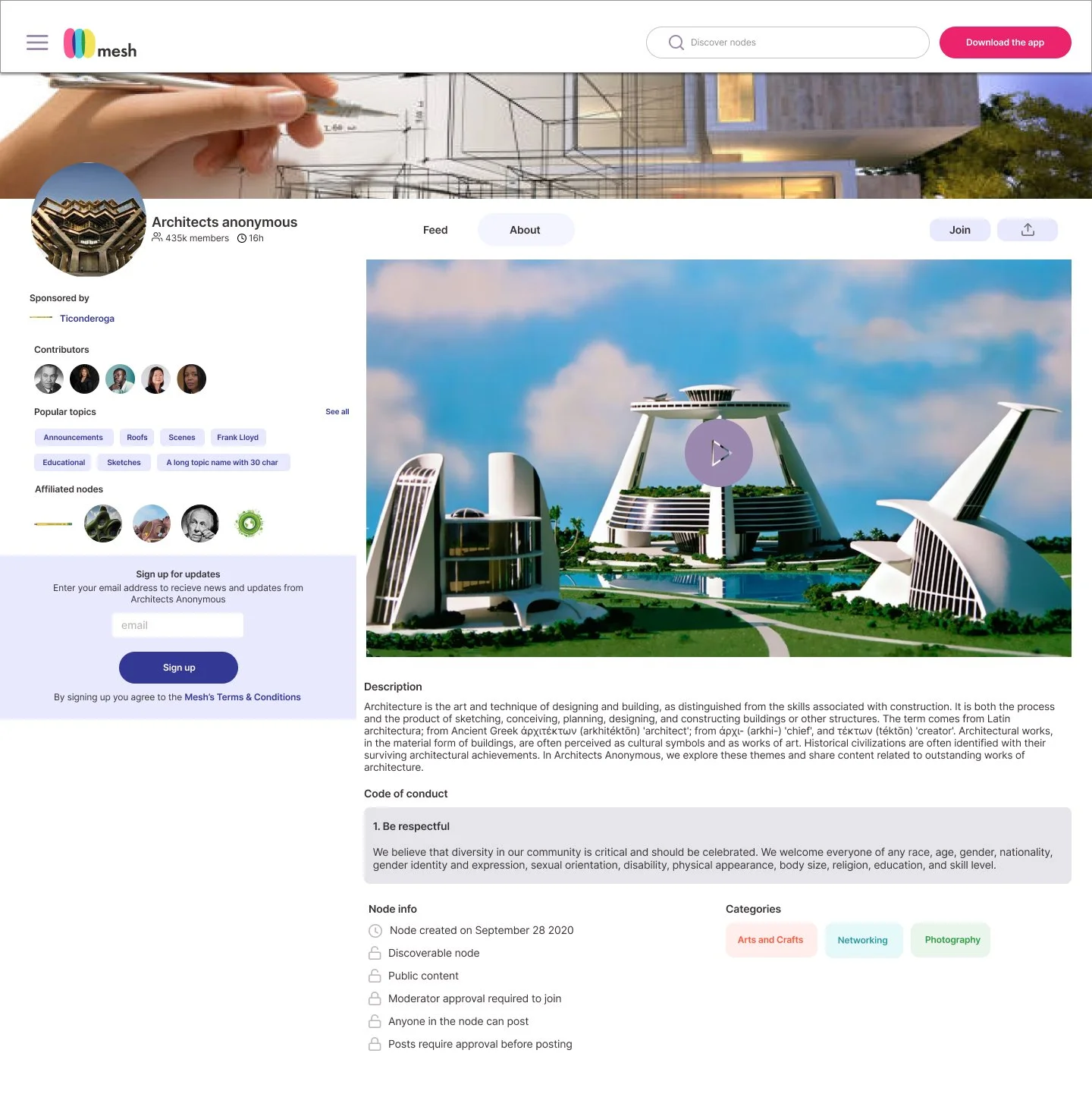
The next option features nodes across the top banner along with a search bar and a download button. Below this, the node information (banner, avatar, bio, and cta buttons) hangs from the left ⅓ panel and the content feed is prominently displayed on the right.

Finally, the 3rd option has the nav menu and search bar fixed to the left 3rd, prominently placed download CTA’s at the top and bottom of the screen. The right 2/3rds features the explore feed.
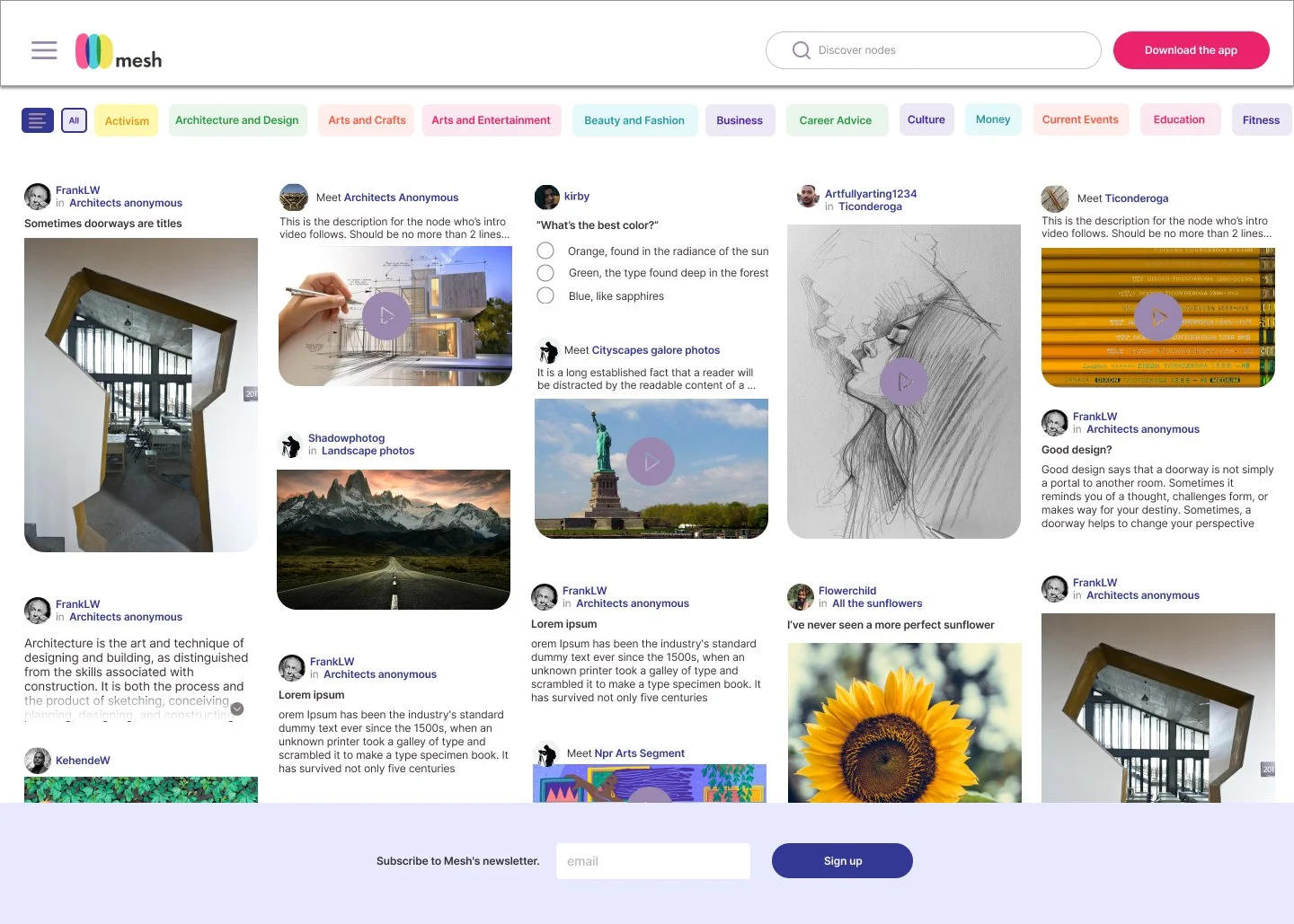
Stakeholders ultimately preferred the second option but wanted the landing page to focus more on visual appeal, with less emphasis on interaction and detail and more on browsing. Incorporating their feedback, I went through several iterations and rounds of discussion—aligning with stakeholders on goals and programmers on technical feasibility—before finalizing the designs shown below.
Conclusion
What worked?
The visual consistency, use of color/space, and engagement elements are likely the most successful elements of this project. As I worked on it, I was very careful to make design decisions that would not overwhelm the user. Instead, I wanted to communicate a plentiful and fun-natured platform that was also well organized and behaved much like the downloadable mobile app.
What didn't work?
The danger I found in completing such a massive project in a short amount of time is that there were many things left undone. I learned a lot about balancing lite functionality with a full experience. While V1 provided a relatively clear window into the possibilities of the app, I think there are some secondary pages that could still stand to be fleshed out and implemented.
What were my doubts going into the project?
My main concern when starting this project was the limited time available for completion. I knew from the beginning that this would be a significant undertaking, but I and stakeholders recognized how essential it was to broaden the platform beyond mobile and allow users even more possibilities to preview before investing time into personalization.
What would I have done differently if given more time?
I would spend more time filling in the plot holes of each flow. As of now, the product contains some information walls, and many actions trigger a download prompt. While this does accomplish the business goal of encouraging users to ‘buy-in’ so to speak, I do not think it creates the most seamless and enjoyable user experience. With a few additional features and a bit more iteration, I’d like to see this product become a fully fleshed web-based version of the mobile app with all of its functionality. Rather than being a window, I think a better experience would be for it to serve as an alternate door down the line.